
Most fundraising dashboards only tell you how much you’ve raised. That’s good to know, but it’s rarely the question you actually need answered.
You also want to know whether anything is broken, whether this month is better or worse than last, and which single change would make the most difference today.
That’s why we’ve rebuilt the dashboard and the Reports Overview around those questions in version 1.8.19 of the Charitable Pro plugin. You’ll also be able to do 3 things you couldn’t do before. You can compare any 2 periods, export the whole summary, and have your setup scored for free!
The Numbers Finally Have Something to Compare Themselves To
A figure on its own doesn’t tell you much. $4,200 raised only means something when you can see what you raised last month.
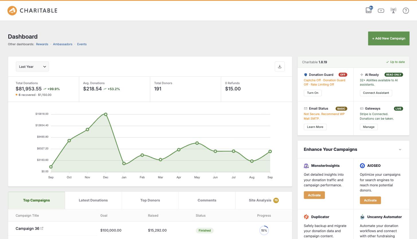
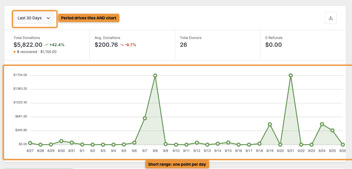
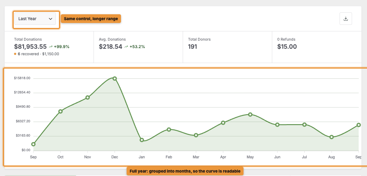
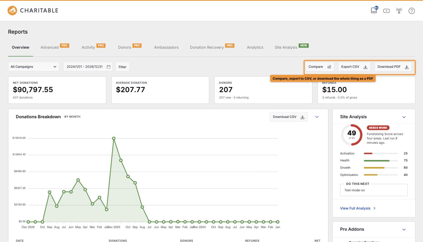
You’ll still see the same headline totals as before. But now when you pick a period, the tiles and the chart update together, and you’ll see each figure’s trend against the previous period. Pick last quarter, and the whole view moves with you.
We’ve also changed how the chart groups your donations. When you pick a short range, you’ll see your donations day by day.
When you pick a longer range, we group them by week or month instead. So if you ask for a full year, you’ll get a clear curve you can actually read, instead of a flat line with a few spikes in it.
Compare Any 2 Periods, Not Just Consecutive Ones
The trend arrows already show you how this month did against last month. With Compare, you can now answer the harder question. How did this December do against last December?
This matters more than it sounds, because fundraising is seasonal. Your December is rarely comparable to your November, so a simple month-to-month trend can make you look better or worse for reasons that have nothing to do with how well you fundraised.
Year over year is the comparison that actually tells you something. Until now, you had to build it yourself in a spreadsheet.
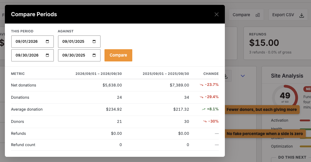
To get started, click Compare on the Reports Overview. You’ll see 2 date ranges, This period and Against, and you can set both to any dates you like. Once you run it, you’ll get a table that compares 6 figures.
- Net donations, donation count and average donation, so you can see volume and value side by side.
- Donors, so you can tell whether growth came from more people giving or the same people giving more.
- Refunds and refund count, so the figures a board member will ask about are in the same view.
You’ll see the percentage change between the 2 periods on every row. It’s always shown from the current period’s side, just like the tiles.
There are 2 more details to know. We use exactly the same calculation for these percentages as for the trend arrows, so a figure in this table will always match the same figure on your dashboard.
And if one side of a comparison is zero, you won’t see a percentage at all. A move from nothing to something is real, but it isn’t a percentage, so we leave it out instead of showing your board a meaningless number.
Read How to Compare Fundraising Between 2 Periods →
Export the Whole Summary, as a Spreadsheet or a PDF
Reports you can’t get out of the admin are reports only you ever see. So now you can export from both screens, in 2 formats for 2 different audiences.
With Download PDF, you’ll get the whole summary as a document, graph included. This is the one to attach to a board pack or a funder update, because it looks like a real report. You’ll find it on both the dashboard and the Reports Overview.
With Export CSV, you’ll get the same summary as data. It’s handy when someone wants to do their own sums in a spreadsheet, or when your finance team wants to check it against their own records.
You can also export the donor and campaign reports on their own with Download CSV, so you only pull the list you need.
The PDF will save you the most time. Getting your numbers in front of a board used to mean screenshotting the dashboard or retyping figures the night before a meeting. Now you can do it in one click, chart included!
Read How to Export Your Donation Reports as a PDF or CSV →
Email This Report, So Nobody Has to Log In
The best report is the one that arrives without anyone asking for it.
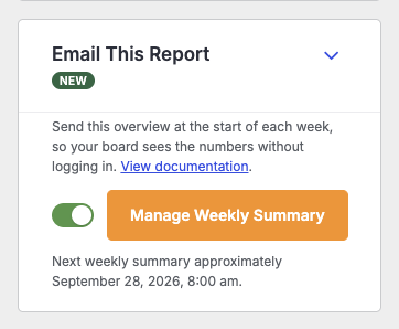
To set it up, find the Email This Report card on the Reports Overview and turn on the switch. The people you choose will get the overview at the start of each week, covering the previous Monday to Sunday. Your change saves straight away, with no page reload.
That means your treasurer, executive director and board chair don’t need a WordPress login, and they don’t need to remember to go and look.
In each email, they’ll see the dates written out in full, a table of that week’s figures, and a link back to the full Reports screen if they want more detail.
Since it’s a real Charitable email, you can make it your own. Click Manage Weekly Summary to open it in the Email Manager, where you can change who gets it and rewrite the wording in your own voice.
Read How to Email a Weekly Fundraising Summary →
Site Analysis: A Free Score Out of 100
We’ve also brought Site Analysis into the Charitable Pro plugin. Think of it as a second opinion on your setup.
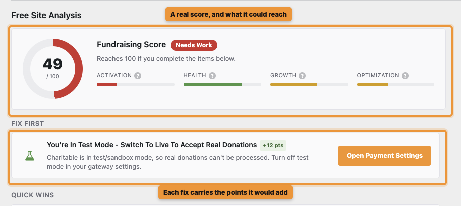
You’ll get a score out of 100 for your fundraising setup, the score your site could reach, and a list of what’s holding you back.
Better still, you won’t just get a grade. You’ll see the specific things to change, ordered by how much difference each one would make, so you always know what to do next.
Each recommendation is specific. Instead of “improve your forms”, it tells you what to change and why it matters.
It’s free to run, with nothing extra to install, and no donor data ever leaves your site. You can refresh it once a day as you work through the list.
Where to Find It
You’ll find your score in 3 places, so it’s always in front of you.
- A tab on your Charitable dashboard, badged with the score itself, so you see it before clicking anything.
- A card on the Reports Overview rail, sitting alongside your headline figures.
- Its own Reports tab, where the full report and the recommendation list live.
Read How to Run and Read Your Site Analysis →
General Status, at a Glance
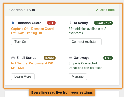
Checking whether anything is broken used to mean opening 5 settings screens. Now you can see it all on one card.
You’ll see your Charitable version, donation protection, AI access, email delivery and payment gateways together, each with its current state and a button beside anything you still need to set up. We read every line live from your settings, so you’re always seeing what’s actually running right now.
So if email delivery isn’t set up, you’ll find out here, before a donor tells you their donation receipt never arrived.
What’s New, Without Leaving Your Dashboard
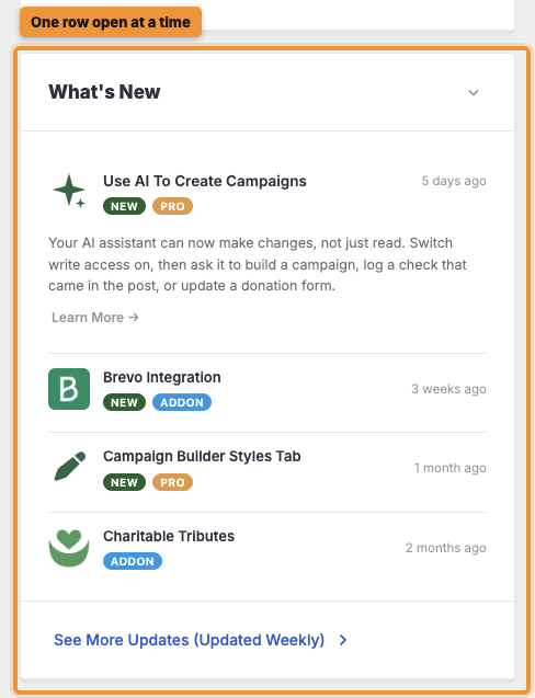
You’ll also see new features and releases right on your dashboard, updated every week. Open a row of the accordion to read about it, or follow the link at the bottom for the full changelog. That way, you won’t find out 6 months later that something you needed was already available.
Read How to Fix Issues on Your Dashboard Status Card →
Two More Cards on Your Dashboard
In the Raise More With Charitable card, you’ll find proven ways to raise more, matched to how you already fundraise. Each one is a concrete step you can take today.
In the Works With Your Tools card, you can connect your email, analytics, automation and page builder tools, plus thousands of apps through Automation Connect. You can set any of them up right there, without leaving the page.
The Rest of the Reports Overview
The Reports Overview now has a 2-column layout with a summary rail beside it. You’ll also see several things you used to work out by hand.
- 📈 Activity timeline and goal pacing: You’ll see whether each campaign is ahead of or behind the pace it needs to reach its goal on time.
- 💳 Payment methods as amounts and shares: You’ll see each gateway as money and a percentage, so you know which one brings in most of your donations.
- 🔁 Recurring Revenue: You’ll see upcoming renewals and how many plans have lapsed, so you can act before a payment is late.
- 🛟 Donation Recovery: You’ll see what abandoned donations are costing you, and how much you’ve won back.
- 📊 Breakdown that matches your range: We group your donations by day, week or month to match the period you pick, so the table and the chart always agree.
Read How to Use the Reports Overview →
A Short Tour, the First Time You Arrive
Both screens have changed a lot, so we’ve added a short guided tour of each one. If you’re on a new site, or updating to 1.8.19, you’ll be offered the tour the first time you arrive. It shows you where the figures come from and what to do with them.
You can take it or dismiss it, and you won’t see it again.
Get Started With the New Dashboard
To get started, update to version 1.8.19 of the Charitable Pro plugin and open Charitable. You’ll be offered the tour, Site Analysis will be ready to run whenever you are, and you’ll find Compare in the Reports toolbar for the next time you want to see how this year compares with last!
Read How to Read Your Charitable Dashboard →
Not Yet on a Charitable Paid Plan?
Charitable Has 1.2+ Million Downloads!
Trusted by millions to power successful fundraising campaigns. Try Charitable risk-free today.
✅ 14-day money-back
✅ Transparent pricing
✅ Code-free setup
What’s New in Charitable
We also launched several powerful features and improvements recently:
🤖
Ask your AI assistant to build, edit and manage your fundraising campaigns for you.
🔁
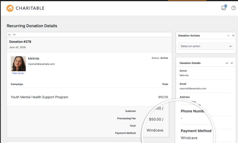
Donors set up a gift once on Windcave, and Charitable bills every renewal on schedule.
🧩
Lay out every automation as a flow of connected cards on a drag-and-drop canvas.
We’ve been adding to Charitable constantly, features and improvements designed to help you raise more and serve your donors better. See everything we’ve shipped at the Charitable Changelog.
Not yet a Charitable Pro user? Sign up today and get up to 50% off on your plan. We’re confident you’ll love raising funds with Charitable. If, for any reason, Charitable is not the right fit for you, we’ll refund your purchase with our 14-day money-back guarantee. Get Charitable Pro Now »
Stay Connected for More Nonprofit Resources
For more tutorials and videos tailored to nonprofits, subscribe to our YouTube channel. We regularly publish expert tips, step-by-step guides on online donations, fundraising strategies, and practical resources to help your organization succeed.
🗞️ Get weekly tips and exclusive guides in your inbox
Join our newsletter →
🎥 Watch step-by-step tutorials and success stories
Subscribe to our YouTube channel →
👩🏽💻 Connect with our community and get daily nonprofit insights
Follow us on LinkedIn →
🥳 Fun reels and non-profit insights
Follow us on Instagram →
👀 Insightful & fun videos to help you grow your cause
Follow us on TikTok→
🌎 Subscribe and follow for general fundraiser tips
Get Fundraiser Tips on TikTok →
Powerful Fundraising Resources
🤖 Use Charitable with Your AI Assistant
⬇️ Download proven strategies, campaign ideas, and expert tools
Get the Fundraising Kit →
💸 Get Free Fundraising Resources
Head to the Charitable Fundraising Hub →
🤔 Got questions about Charitable?
Charitable FAQs →
🏎️ Take Charitable for a spin
Create your Charitable Demo →
Understand non-profit terms and jargon
Non-Profit Glossary →
% Looking for non-profit deals and discounts?
Best Non-Profit Deals and Discounts →

Charitable Now Works With the AI Assistant You Already Use
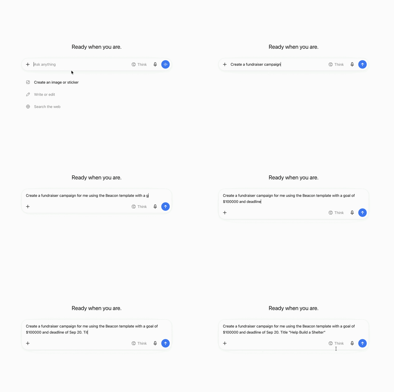
This is the most fun thing we’ve shipped all year, and you have to try it. You can now use ChatGPT, Claude, or any AI assistant you’re already using to build and launch fundraiser campaigns.
You can create donation records, manage donor profiles, fetch data, and get fundraising reports too. Simply connect your AI agent, and start asking for what you want.
No Charitable addon needed, no coding, and no elaborate setup. Anyone can do it!





Leave a Reply