Want your donation form to actually look like it belongs to your nonprofit, instead of a generic add-on bolted onto your campaign page?
The Styles tab in the Campaign Builder lets you set colors, fonts, and per-field styling for every campaign, all without writing a line of CSS.
What’s in this Guide?
Opening the Styles Tab
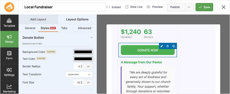
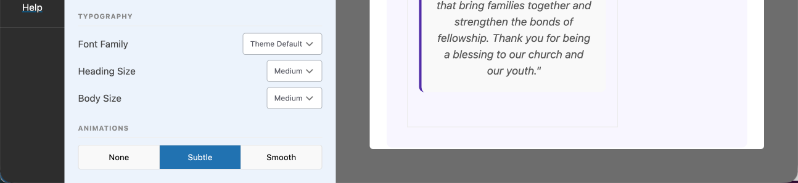
The Styles tab lives inside the Campaign Builder’s Design panel.
- In wp-admin, go to Campaigns and open the campaign you want to style, or create a new one.
- Click Edit With Builder.
- In the builder, open the Design panel on the right side, then click the Styles tab. Look for the NEW badge next to it, alongside General, Tabs, and Advanced.
Important Note: The Campaign Builder, including the Styles tab, requires Charitable Pro 1.8.17 or later.
Choosing a Design Preset
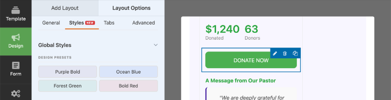
At the top of the Styles tab, under Global Styles, you’ll find four Design Presets: Purple Bold, Ocean Blue, Forest Green, and Bold Red.
Click any preset to apply a coordinated set of colors, typography, and animation to the whole campaign in one click. A preset is a starting point, not a final answer. Pick whichever one is closest to your brand, then fine-tune the Global Colors, Typography, and Animations below it.
[Screenshot: global styles design presets.png: the Global Styles section showing the four Design Preset options]
Setting Your Global Colors
Global Colors are the palette your whole campaign draws from. Set one once and it flows into every field that doesn’t have its own override.
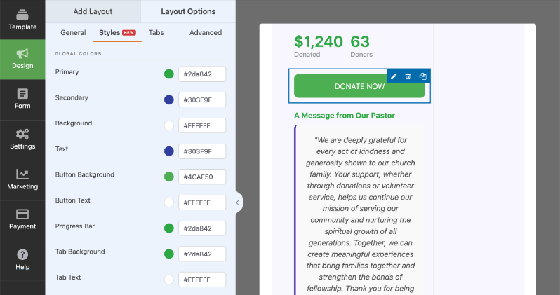
You’ll find nine Global Colors, each with a color swatch and a hex value field:
- Primary: your main brand color, used across accents and highlights
- Secondary: a supporting color, used for things like accent borders
- Background: the form’s background color
- Text: the default text color across the form
- Button Background: the fill color for the Donate button
- Button Text: the label color on the Donate button
- Progress Bar: the fill color of the fundraising progress bar
- Tab Background: the background color for donation tabs
- Tab Text: the label color on donation tabs
Click a swatch to open the color picker, or type a hex value directly into the field next to it.
Pro tip: If you manage campaigns for multiple causes on one site, give each campaign its own Global Colors instead of relying on one shared palette. A disaster relief campaign and a scholarship fund don’t have to look the same.
Setting Typography and Animations
Below Global Colors, the Typography section controls the fonts and sizing for the whole form.
- Font Family: choose Theme Default, Sans-Serif, Serif, or Monospace
- Heading Size: choose Small, Medium, or Large
- Body Size: choose Small, Medium, or Large
Underneath Typography, the Animations section controls how the form and progress bar move. Choose None, Subtle, or Smooth.
Pro tip: If you or your donors prefer reduced motion, set Animations to None. The builder respects that choice everywhere the form and progress bar would otherwise move.
Styling Individual Fields
Global Colors and Typography set the overall look. When a specific field needs to stand out, or blend in, click that field directly in the live preview to open its own Box Styles.
The exact controls change depending on the field type, but here’s what you’ll find on the most common ones.
Text and List Fields
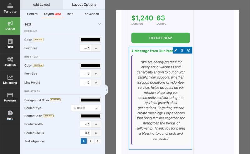
Click a text or list field in the preview and you’ll see three groups of controls: Headline, Body Text, and Box Styles.
- Headline: Color and Font Size
- Body Text: Color, Font Size, and Line Height
- Box Styles: Background Color, Border Style (No Border, Left Border Only, or Full Border), Border Color, Border Width, Border Radius, and Text Alignment
Donate Button
Click the Donate button in the preview to set its Background Color, Text Color, Border Radius, Text Transform (for example, Uppercase), and Font Size.
Photos
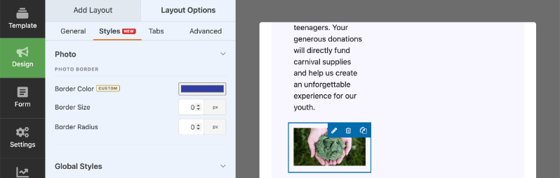
Click a photo field to set its Photo Border: Border Color, Border Size, and Border Radius.
Progress Bar
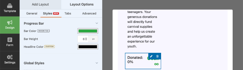
Click the progress bar to set its Bar Color, Bar Height, and Headline Color.
The same kind of per-field styling reaches countdowns, donation tabs, and other field types too, so nothing on the form is stuck looking out of place.
Understanding Custom vs. Inherited Styles
Next to some color controls in a field’s Box Styles, you’ll see a small tag that reads either CUSTOM or INHERITED.
- INHERITED means the field is pulling its color from Global Colors. Change the Global Color and this field updates automatically.
- CUSTOM means you’ve set an override for this specific field. It won’t change when you update Global Colors.
For example, a List field’s accent border pulls from your campaign’s Secondary color automatically, so it shows INHERITED until you set your own color for it. That’s what lets you set a palette once and have most fields fall in line, while still giving you the option to make any single field its own thing.
Saving and Previewing Your Changes
Every change in the Styles tab updates the live preview next to it instantly. There’s no separate preview button and nothing to refresh.
Important: The live preview shows your changes right away, but they aren’t applied to the published campaign page until you click Save.
What Happens to Existing Campaigns
If you built a campaign before the Styles tab existed, you don’t need to do anything. Your campaign was migrated into the new styling system automatically, with no data loss, and it keeps its original look until you decide to open the Styles tab and change it.
For Developers and Agencies
Everything you set in the Styles tab is stored in a single campaign_style_tokens meta value as design tokens, not scattered inline styles. That keeps the output clean and makes a campaign’s styling easy to read, move, or reuse elsewhere.
If you build for clients, you can extend the Styles tab with your own controls:
- Register custom per-field controls in JavaScript through
window.charitableDesignFieldControls. - Hook into server-side rendering with the
charitable_design_styles_globalandcharitable_design_styles_fieldactions.
None of this is required to use the Styles tab day to day. It’s there for agencies and developers who want to go further.
FAQs on the Styles Tab
Does this require Charitable Pro?
Yes. The Campaign Builder, including the Styles tab, is a Charitable Pro feature and requires Charitable Pro 1.8.17 or later.
Will it change campaigns I already built?
No. Existing campaigns keep their current look. They’re migrated into the Styles system automatically, with no data loss, and stay exactly as they were until you edit them.
Do I need to know CSS?
No. Every control in the Styles tab is visual. Developers can extend it further with hooks and filters, but you’ll never need code just to use it.
Will my styling look right on mobile?
Yes. Colors, typography, and field styling all carry through to the live donation form on any screen size.
Can I reuse a look across campaigns?
Yes. Apply the same Design Preset and Global Colors to any campaign to keep a consistent, on-brand feel. Any campaign that needs to stand apart is still free to use its own colors and field styling.
That’s it! You’ve learned how to use the Styles tab to design an on-brand donation form, from the overall palette down to individual fields.
Next, you may also want to learn more about the Campaign Builder or how to customize your donation form.
Charitable Has 1.2+ Million Downloads!
Trusted by millions to power successful fundraising campaigns. Try Charitable risk-free today.
✅ 14-day money-back
✅ Transparent pricing
✅ Code-free setup
Stay Connected for More Nonprofit Resources
For more tutorials and videos tailored to nonprofits, subscribe to our YouTube channel. We regularly publish expert tips, step-by-step guides on online donations, fundraising strategies, and practical resources to help your organization succeed.
🗞️ Get weekly tips and exclusive guides in your inbox
Join our newsletter →
🎥 Watch step-by-step tutorials and success stories
Subscribe to our YouTube channel →
👩🏽💻 Connect with our community and get daily nonprofit insights
Follow us on LinkedIn →
🥳 Fun reels and non-profit insights
Follow us on Instagram →
👀 Insightful & fun videos to help you grow your cause
Follow us on TikTok→
🌎 Subscribe and follow for general fundraiser tips
Get Fundraiser Tips on TikTok →
Powerful Fundraising Resources
🤖 Use Charitable with Your AI Assistant
⬇️ Download proven strategies, campaign ideas, and expert tools
Get the Fundraising Kit →
💸 Get Free Fundraising Resources
Head to the Charitable Fundraising Hub →
🤔 Got questions about Charitable?
Charitable FAQs →
🏎️ Take Charitable for a spin
Create your Charitable Demo →
Understand non-profit terms and jargon
Non-Profit Glossary →
% Looking for non-profit deals and discounts?
Best Non-Profit Deals and Discounts →